Today we've launched our new brand identity and website, and we’re excited to introduce you to our new look!
Our distinctive new brand identity including our new colours, logo and ‘unique angle’, are unique representations of our company and ensure we stand-out visually. Despite the new look and feel, we are still the Funds-Axis we’ve always been. The only difference is we now have a top-class brand identity to match our highly efficient and secure, multi-modular global funds technology.
We’re thrilled to unveil our refreshed brand identity and redesigned website. The updates show the evolution of our company since its founding in 2005 and pave the way for how we’re moving forward.
Our Logo
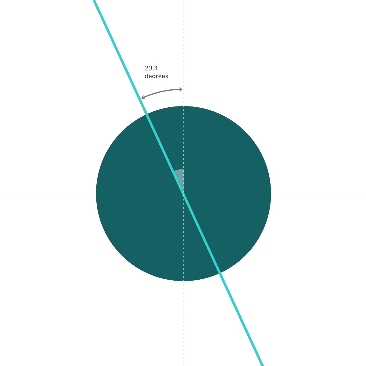

Funds-Axis - A UNIQUE ANGLE
The Earth sits at a 23.4 degree angle on its axis. We take a similarly unique angle.
We are creative, original and memorable. We adopt interesting ways to think about what we do, turning the familiar into something fresh. We offer unique insight and perspective. We are intelligent and innovative. We know that the companies who think smart and are most comfortable with change are the ones that survive and win. We aren’t afraid to aim high.
We are confident and precise. We know what we’re talking about. We’re not arrogant, but we are robust and unambiguous. We know that clarity and transparency matters. We value simplicity and untangling complexity.
Our New Website
After months of hard work and dedication, we are delighted to officially announce the launch our new website!
As a technology and innovation leader, it’s important for us to make information regarding our thought leadership, services and trends easily accessible for our current and prospective clients. We endeavour to provide our client partners with the most accurate, up-to-date information and share our knowledge and regulatory expertise.
Take a look around, explore our new pages, and let us know what you think! Feel free to reach out to us on social media or send us a message online via our contact page.
